The language of CSS has had an explosion of new features and improvements in the last few years. As a result, feature parity between browsers is at an all-time high, and efforts are being made to continue releasing features consistently and synchronously among evergreen browsers.
Today, we will explore modern project architecture, emphasizing theming, responsive layouts, and component design. We'll learn about features to improve code organization and dig into layout techniques such as grid and container queries. Finally, we'll review real-world examples of context-aware components that use cutting-edge CSS techniques. You're sure to be inspired to expand your CSS skills and ready to create scalable, future-friendly web projects.
CSS Reset Additions
#Since the early days of CSS, a convention to tame cross-browser styling inconsistencies has been the CSS reset. This refers to a group of rules that do things like to remove default spacing attributes or enforce inheritance of font styles. It has also grown more flexible in definition, and some folks use it as a place to put baseline global style overrides.
Here are a few handy rules I now place in my reset to take advantage of modern CSS features. A wonderful thing about these rules is they are also progressive enhancements that don't strictly require fallbacks. If they are supported in a browser and are applied, great! And if not, there's no or minimal impact on the user experience.
I set a common baseline for default links, which are scoped to those without a class. This is an assumption that classless links are intended to keep a regular, underlined link appearance. The update is to set the underline to use a relative thickness and increase the underline offset. The visual outcome may be minor, but it can improve the legibility of links, especially when presented in a list or other close-proximity contexts.
/* Baseline for default links */
a:not([class]) {
  /* Relatively sized thickness and offset */
  text-decoration-thickness: max(0.08em, 1px);
  text-underline-offset: 0.15em;
}
The max() function asks the browser to choose the larger of the presented options, which effectively ensures that in this rule, the underline cannot be thinner than 1px.
An exciting cross-browser update as of March 2022 was a switch of the default focus behavior for interactive elements to use :focus-visible by default. Whereas the :focus state applies no matter how an element receives focus, :focus-visible only produces a visible focus state based on the heuristics of the user's input modality. Practically speaking, this means that typically mouse users will not see a visible focus for elements like links or buttons, but a keyboard user who accesses those elements through tabbing will see a visible focus style.
As for our reset, this means our visible focus styles will be attached to only the :focus-visible state.
:focus-visible {
  --outline-size: max(2px, 0.15em);

  outline: var(--outline-width, var(--outline-size)) var(--outline-style, solid)
    var(--outline-color, currentColor);
  outline-offset: var(--outline-offset, var(--outline-size));
}
In this rule, custom properties are used to set the various outline attributes. This allows the creation of a common baseline for our application's focus styles while allowing overrides for components as needed.
You might also be less familiar with the outline-offset property, which defines the distance between the element and the outline. This property can use a negative value to inset the outline and place it inside the element. I often do this override for button component styles to ensure the outlines retain accessible contrast against the element.
I’ve written about this outline technique before if you’d like to learn more.
The last two additions to my reset involve improving the scroll position for targeted or focused elements.
Using scroll-padding properties, you can adjust the scroll position in relation to elements. The "padding" space does not affect the layout, just the offset of the scroll position.
In this rule, the :target selector matches when an element is a target of an anchor link, also known as a "document fragment." The scroll-padding-block-start will allow for room between the target and the top of the viewport.
/* Scroll margin allowance above anchor links */
:target {
  scroll-padding-block-start: 2rem;
}
The use of scroll-padding-block-end in this next rule allows for room between a focused element and the bottom of the viewport, which helps with tracking visible focus position.
/* Scroll margin allowance below focused elements
  to ensure they are clearly in view */
:focus {
  scroll-padding-block-end: 8vh;
}
Values for both rules can be adjusted to work best with your application layout. Consider that you might need a little bit of help from JavaScript if you need to account for sticky headers or footers.
Project Architecture
#Next up are two features with the potential to strongly impact your project architecture: nesting and cascade layers.
CSS Nesting
#Native CSS nesting began to be supported in Chromium 112, Safari 16.5, and very newly in Firefox Nightly so stable support should be shortly behind.
For those who have used a preprocessor like Sass or LESS, native nesting will be familiar, but it does have some unique rules.
Any selector type is valid as a nested selector. The ampersand - & - character is also available and refers to the top-level selector, so that is one way to begin a nested selector.
Selectors such as :is() or :where() are useful in nested selectors. And standard class or attribute selection is also allowed, as well as the other combinators.
.my-element {
  a {
  }

  & a {
  }

  :is(a, button) {
  }

  .button {
  }

  [data-type] {
  }

  + .another-element {
  }
}
A possible gotcha with nesting selectors is that the compound result creates descendent selectors. In other words, a space character is added between the top-level selector and the nested selector. When you intend to have the nested selector be appended to the top-level selector, the use of the & enables that result.
.my-element {
  [data-type] {
  }

  &[data-type] {
  }
}

/* Results in: */
.my-element [data-type] {
}
.my-element[data-type] {
}
Use of & also allows nested selectors for pseudo-elements and pseudo-classes.
.my-element {
  &::before {
  }

  &:hover {
  }
}
Review more examples of valid and invalid nesting rules from Jen Simmons and Adam Argyle.
You can safely begin using nesting today without Sass or LESS by incorporating a build tool such as LightningCSS, which will pre-combine the selectors for your final stylesheet based on your browser targets.
CSS Cascade Layers
#In a coordinated cross-browser rollout, the new at-rule of @layer became available as of Chromium 99, Safari 15.4, and Firefox 97 in early 2022. This at-rule is how to manage CSS cascade layers, which allows authors more control over two key features of the "C" in CSS: specificity and order of appearance. This is significant because those are the last two determining factors a browser considers when applying an element's style.
Using @layer, we can define groups of rule sets with a pre-determined order to reduce the likelihood of conflicts. Being able to assign this order largely prevents the need to use !important and enables easier overrides of inherited styles from third-party or framework stylesheets.
The critical rules to understand about cascade layers are:
- the initial order of layers defines the applied priority order
- priority increases in order
- ex. first layer has less priority than the last layer
- less-nested layered styles have priority over deeper nested layer styles
- un-layered styles have the highest priority over layered styles
In this example, the initial layer order is given as global followed by typography. However, the styles added to those layers are written so that the typography layer is listed first. But, the p will be blue since that style is defined in the typography layer, and the initial layer order defines the typography layer later than the global layer.
@layer global, typography;

p {
  margin-bottom: 2rem;
}

@layer typography {
  p {
    color: blue;
    margin: 0;
  }

  @layer colors {
    p {
      color: pink;
    }
  }
}

@layer global {
  p {
    color: hsl(245 30% 30%);
  }
}
The nested layer of color within typography also has lower-priority than the un-nested style. Finally, the paragraph will also have a margin-bottom of 2rem since the un-layered style has higher priority over the layered styles.
Learn more in my guide to cascade layers, and watch Bramus Van Damme’s talk from CSS Day 2022.
As with many newer features, there is much room for experimentation, and "best practices" or "standards of use" have not been established. Decisions like whether to include cascade layers, what to name them, and how to order them will be very project dependent.
Here’s a layer order I have been trying out in my own projects:
@layer reset, theme, global, layout, components, utilities, states;Miriam Suzanne, the spec author for cascade layers, describes a few contexts and other considerations for naming and ordering layers.
Moving to cascade layers is a bit tricky, although a polyfill is available. However, at-rules cannot be detected by @supports in CSS. Even if they could, there's still the issue that un-layered styles that you may not be ready to move to layers would continue to override layer styles.
The desire to detect @layer support and minimize the conflict between layered and un-layered styles was a motivating factor in creating my project SupportsCSS, a feature detection script. It adds classes to <html> to indicate support or lack thereof, which can then be used as part of your progressive enhancement strategy for many modern CSS features, including cascade layers.
Join my newsletter for article updates, CSS tips, and front-end resources!
Theming and Branding
#There are three features I immediately begin using when starting a new project, large or small. The first is custom properties, also known as CSS variables.
The 2022 Web Almanac - which sources data from the HTTP Archive dataset and included 8.36M websites - noted that 43% of pages are using custom properties and have at least one var() function. My prediction is that number will continue to grow dramatically now that Internet Explorer 11 has reached end-of-life, as lack of IE11 support prevented many teams from picking up custom properties.
The Almanac results also showed that the ruling type used by custom property values was color, and that is in fact how we’ll begin using them as well.
For the remainder of the examples, we’ll be building up components and branding for our imaginary product Jaberwocky.
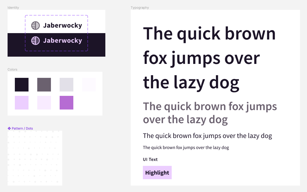
We’ll begin by placing the brand colors as custom properties within the :root selector, within our theme layer.
@layer theme {
  :root {
    /* Color styles */
    --primary: hsl(265, 38%, 13%);
    --secondary: hsl(283, 6%, 45%);
    --tertiary: hsl(257, 15%, 91%);
    --light: hsl(270, 100%, 99%);
    --accent: hsl(278, 100%, 92%);
    --accent--alt: hsl(279, 100%, 97%);
    --accent--ui: hsl(284, 55%, 66%);
  }
}
You may also wish to place font sizes or other "tokens" you anticipate re-using in this theme layer. Later, we'll elevate some component properties to this global space. We'll also continue to inject custom properties throughout our layout utilities and component styles to develop an API for them.
Now that we have a brand and color palette, it's time to add the other two features.
First is color-scheme, which allows us to inform the browser whether the default site appearance is light or dark or assign a priority if both are supported. The priority comes from the order the values are listed, so light dark gives "light" priority. The use of color-scheme may affect the color of scrollbars and adjust the appearance of input fields. Unless you provide overrides, it can also adjust the background and color properties. While we are setting it on html, you may also localize it to a certain component or section of a layout. Sara Joy shares more about how color-scheme works.
The second property is accent-color which applies your selected color to the form inputs of checkboxes, radio buttons, range, and progress elements. For radio buttons and checkboxes, this means it's used to color the input in the :checked state. This is an impactful step towards theming these tricky-to-style form inputs and may be a sufficient solution instead of completely restyling. Michelle Barker shares more on how accent-color works.
If you do feel you need to have full style control, see my guides to styling radio buttons and styling checkboxes.
Jaberwocky best supports a light appearance, and will use the darkest purple that is assigned to --accent--ui for the accent-color.
@layer theme {
  html {
    color-scheme: light;
    accent-color: var(--accent--ui);
  }
}
Layout
#There is so much we could cover regarding CSS layout, but I want to share two utilities I use in nearly every project for creating responsive grids. The first solution relies on CSS grid, and the second on flexbox.
CSS Grid Layout
#Using CSS grid, this first utility creates a responsive set of columns that are auto-generated depending on the amount of available inline space.
Beyond defining display: grid, the magic of this rule is in the assignment for grid-template-columns which uses the repeat() function.
CSS for "CSS Grid Layout"
@layer layout {
  .layout-grid {
    display: grid;
    grid-template-columns: repeat(
      auto-fit,
      minmax(min(100%, 30ch), 1fr)
    );
  }
}
The first parameter within repeat uses the auto-fit keyword, which tells grid to create as many columns as can fit given the sizing definition which follows. The sizing definition uses the grid-specific function of minmax(), which accepts two values that list the minimum and maximum allowed size for the column. For the maximum, we've used 1fr, which will allow the columns to stretch out and share the space equitably when more than the minimum is available.
For the minimum, we've included the extra CSS math function of min() to ask the browser to use the smaller computed size between the listed options. The reason is that there is potential for overflow once the available space is more narrow than 30ch. By listing 100% as an alternate option, the column can fill whatever space is available below that minimum.
The behavior with this minimum in place means that once the available space becomes less than the amount required for multiple elements to fit in the row, the elements will drop to create new rows. So with a minimum of 30ch, we can fit at least three elements in a 100ch space. However, if that space reduces to 70ch, then only two would fit in one row, and one would drop to a new row.
To improve customization, we'll drop in a custom property to define the minimum allowed size for a column, which will function as a "breakpoint" for each column before causing the overflow to become new rows. For the most flexibility, I also like to include a custom property to allow overriding the gap.
@layer layout {
  .layout-grid {
    --layout-grid-min: 30ch;
    --layout-grid-gap: 3vw;

    display: grid;
    grid-template-columns: repeat(
      auto-fit,
      minmax(min(100%, var(--layout-grid-min)), 1fr)
    );
    gap: var(--layout-grid-gap);
  }
}
Since this solution uses CSS grid, the grid children are destined to stay in a grid formation. Items that drop to create new rows will remain constrained within the implicit columns formed on the prior rows.
CSS Flexbox Layout
#Sometimes in a grid with an odd number of children, you may want to allow them to expand and fill any leftover space. For that behavior, we switch our strategy to use flexbox.
The flexbox grid utility shares two common features with the CSS grid utility: defining a minimum "column" size and the gap size.
With CSS grid, the parent controls the child size. But with flexbox, the children control their sizing. Therefore, it's more safe to use a non-relative value for the column size, since using a font-relative unit like ch may change the outcome depending on the child's own font-size.
Beyond the custom properties API, the base flexbox grid utility simply sets up the display and wrap properties. Wrapping is important so that elements can drop and create new rows as space decreases.
@layer layout {
  .flex-layout-grid {
    --flex-grid-min: 20rem;
    --flex-grid-gap: 3vmax;

    display: flex;
    flex-wrap: wrap;
    gap: var(--flex-grid-gap);

    > * {
      flex: 1 1 var(--flex-grid-min);
    }
  }
}
Since our utility doesn't know what the flexbox children will be, we'll use the universal selector - * - to select all direct children to apply flexbox sizing. With the flex shorthand, we define that children can grow and shrink and set the flex-basis to the minimum value.
@layer layout {
  .flex-layout-grid {
    > * {
      flex: 1 1 var(--flex-grid-min);
    }
  }
}
As with the previous grid utility, this “min” value will cause elements to wrap to new rows once the available space is reduced. The difference is that the flex-grow behavior will allow children to grow into unused space within the row. Given a grid of three where only two elements can fit in a row, the third will expand to fill the entire second row. And in a grid of five where three elements can align, the remaining two will share the space of the second row.
CSS for "CSS Flexbox Grid Layout"
@layer layout {
  .flex-layout-grid {
    --flex-grid-min: 20rem;
    --flex-grid-gap: 3vmax;

    display: flex;
    flex-wrap: wrap;
    gap: var(--flex-grid-gap);

    > * {
      flex: 1 1 var(--flex-grid-min);
    }
  }
}
Prepare for Container Queries
#Shortly, we will use container size queries to develop several component styles. Container size queries allow developing rules that change elements based on available space.
To correctly query against the size of flexbox or grid children, we can enhance our utilities to include container definitions.
We’ll default the container name to grid-item while also allowing an override via a custom property. This allows specific container query instances to be explicit about which container they are querying against.
@layer layout {
  :is(.layout-grid, .flex-layout-grid) > * {
    container: var(--grid-item-container, grid-item) / inline-size;
  }
}
Later examples will demonstrate how to use features of container size queries and make use of these layout utility containers.
Note: There is a bug as of Safari 16.4 where using containment on a grid using
auto-fitcollapses widths to zero, so proceed with caution if you use this strategy before the bug is resolved.
Component: Buttons
#We’ve reached the first of four components we’ll develop to showcase even more modern CSS features. While you won’t have a complete framework after four components, you will have a solid foundation to continue building from and some shiny new things in your CSS toolbox!
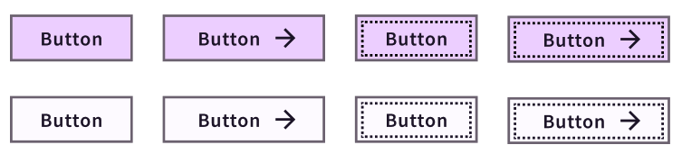
Our styles will support the following variations of a button:
- a button element
- a link element
- text plus an icon
- icon plus text
- icon-only
There are some reset properties beyond the scope of this article, but the first properties that make a difference in customizing our buttons have to do with color.
Custom Property and Component APIs
#For both the color and background-color properties, we’ll begin to develop an API for our buttons by leveraging custom properties.
The API is created by first assigning an undefined custom property. Later, we can tap into that API to easily create button variants, including when adjusting for states like :hover or :disabled.
Then, we use the values that will signify the "default" variant for the second value, which is considered the property's fallback. In this case, our lavender --accent property will be the default color. Our --primary for this theme is nearly black, and will be the complimenting default for the color property.
@layer components {
  .button {
    color: var(--button-color, var(--primary));
    background-color: var(--button-bg, var(--accent));
  }
}
Creating Variant Styles with :has()
#Next, we’ll address the presence of an .icon within the button. Detecting presence is a special capability of the very modern feature :has().
With :has(), we can look inside the button and see whether it has an .icon and if it does, update the button’s properties. In this case, applying flex alignment and a gap value. Because appending the :has() pseudo class will increase the specificity of the base class selector, we’ll also wrap the :has() clause with :where() to null the specificity of the clause to zero. Meaning, the selector will retain the specificity of a class only.
.button:where(:has(.icon)) {
  display: flex;
  gap: 0.5em;
  align-items: center;
}
In our markup for the case of the icon-only buttons is an element with the class of .inclusively-hidden, which removes the visible label but still allows an accessible label for assistive technology like screen readers. So, we can look for that class to signify the icon-only variation and produce a circle appearance.
.button:where(:has(.inclusively-hidden)) {
  border-radius: 50%;
  padding: 0.5em;
}
Next, for buttons without icons, we want to set a minimum inline size, and center the text. We can achieve this by combining the :not() pseudo-class with :has() to create a selector that says “buttons that do not have icons.”
.button:where(:not(:has(.icon))) {
  text-align: center;
  min-inline-size: 10ch;
}
Our final essential button variation is the case of buttons that are not icon-only. This means text buttons and those that include an icon. So, our selector will again combine :not() and :has() to say “buttons that do not have the hidden class,” which we noted was the signifier for the icon-only variant.
.button:where(:not(:has(.inclusively-hidden))) {
  padding: var(--button-padding, 0.75em 1em);
  border-radius: 0;
}
This variant exposes a --button-padding custom property, and sets an explicit border-radius.
CSS for "Button Component"
.button {
  color: var(--button-color, var(--primary));
  background-color: var(--button-bg, var(--accent));
}

.button:where(:has(.icon)) {
  display: flex;
  gap: 0.5em;
  align-items: center;
}

.button:where(:has(.inclusively-hidden)) {
  border-radius: 50%;
  padding: 0.5em;
}

.button:where(:not(:has(.icon))) {
  text-align: center;
  min-inline-size: 10ch;
}

.button:where(:not(:has(.inclusively-hidden))) {
  padding: var(--button-padding, 0.35em 1em);
  border-radius: 0;
}
Using Custom Properties API for States
#While the initial visual appearance is complete, we need to handle for two states: :hover and :focus-visible. Here is where we get to use our custom properties API, with no additional properties required to make the desired changes.
For the :hover state, we are updating the color properties. And for :focus-visible, we're tapping into the API we exposed for that state within our reset. Notably, we're using a negative outline-offset to place it inside the button boundary which helps with ensuring proper contrast.
.button:hover {
  --button-bg: var(--accent--alt);
  --button-color: var(--primary);
}

.button:focus-visible {
  --outline-style: dashed;
  --outline-offset: -0.35em;
}
Component: Card
#
For the card component, we have three variants and one state to manage:
- default, small card
- “new” style
- wide with larger text
- focus-visible state
We’ll start from the baseline styles that provide the basic positioning and styles of the card elements. The styles don’t match our mocked-up design, but the cards are usable. And that’s pretty critical that our component generally “works” without the latest features! From this base, we can progressively enhance up to our ideal appearance.
Here are a few other details about our cards and expected usage:
- we’ll place them within our flexbox-based layout grid
- the layout grid will be within a wrapping container
The cards will anticipate the layout grid and it’s wrapper, which both have been defined as containers with distinct names. That means we can prepare container queries to further adjust the card layouts.
CSS for "Base Card Styles"
.card {
  --card-bg: var(--demo-light);
  --dot-color: color-mix(in hsl, var(--demo-primary), transparent 95%);

  background-color: var(--card-bg);
  background-image: radial-gradient(var(--dot-color) 10%, transparent 12%),
    radial-gradient(var(--dot-color) 11%, transparent 13%);
  background-size: 28px 28px;
  background-position: 0 0, 72px 72px;
  padding: 1rem;
  border: 1px solid var(--demo-primary);
  position: relative;
  height: 100%;
  display: grid;
  gap: 1rem;
  align-content: space-between;
}

.card__number-icon {
  display: flex;
  justify-content: space-between;
}

.card__number-icon::before {
  content: "0" attr(data-num);
  background-color: var(--demo-accent);
  font-weight: 600;
  font-size: 1.15rem;
}

.card__number-icon::before,
.card__number-icon img {
  width: 2.25rem;
  aspect-ratio: 1;
  display: grid;
  place-content: center;
}

.card__number-icon img {
  border: 2px solid var(--demo-tertiary);
  padding: 0.15rem;
}

.card a {
  text-decoration: none;
  color: var(--demo-primary);
}

.card a::before {
  content: "";
  position: absolute;
  inset: 0;
}

.card :is(h2, h3) {
  font-weight: 400;
  font-size: 1.25rem;
}

.card a {
  font-size: inherit;
}
Styling Based on Element Presence
#Let’s start with the “New” card variation. There are two details that change, both based on the presence of the .tag element. The hint about how to handle these styles is that we’re detecting the presence of something, which means we’ll bring in :has() for the job.
The first detail is to add an additional border to the card, which we’ll actually apply with a box-shadow because it will not add length to the card’s box model like a real border would. Also, the card already has a visible, actual border as part of it’s styling, which this variation will retain.
.card:has(.tag) {
  box-shadow: inset 0 0 0 4px var(--accent);
}
The other detail is to adjust the display of the headline, which the “New” tag resides in. This selector will be scoped to assume one of two header tags has been used. We’ll use :is() to efficiently create that group. And since we’ll be adding more headline styling soon, we’ll also try out nesting for this rule.
.card :is(h2, h3) {
  &:has(.tag) {
    display: grid;
    gap: 0.25em;
    justify-items: start;
  }
}
CSS for "'New' Card"
.card:has(.tag) {
  box-shadow: inset 0 0 0 4px var(--demo-accent);
}

.card :is(h2, h3):has(.tag) {
  display: grid;
  gap: 0.25em;
  justify-items: start;
}
Special Focus Styling
#Our baseline card styles include a method for making the card surface seem clickable even though the link element only wraps the headline text. But when the card link is focused, we want an outline to correctly appear near the perimeter of the card.
We can achieve this without any positioning hackery by using the :focus-within pseudo-class. With :focus-within, we can style a parent element when a child is in a focused state. That let’s us add a regular outline to the card by providing a negative outline-offset to pull it inside the existing border.
.card:focus-within {
  outline: 3px solid #b77ad0;
  outline-offset: -6px;
}
That still leaves us the default outline on the link, which we’ll switch to use a transparent outline. The reason is that we still need to retain the outline for focus visibility for users of forced-colors mode, which removes our defined colors and swaps to a limited palette. In that mode, transparent will be replaced with a solid, visible color.
.card a:focus-visible {
  --outline-color: transparent;
}
The final stateful style we’ll add is to include a text underline on the link when it is hovered or has visible focus. This helps identify the purpose as a link.
.card a:is(:hover, :focus-visible) {
  text-decoration: underline;
}
CSS for "Card States"
.card:focus-within {
  outline: 3px solid #b77ad0;
  outline-offset: -6px;
}

.card a:is(:focus, :focus-visible) {
  outline: 1px solid transparent;
}

.card a:is(:hover, :focus-visible) {
  text-decoration: underline;
}
Context-Based Container Queries
#Since we’ve placed our demo cards in the flexbox layout grid, they already seem to be responsive. However, our design mockup included a “wide” card variation that is slightly different than simply stretching out the basic card.
If you recall, we already defined each child of our flexbox grid to be a container. The default container name is grid-item. Additionally, there is a wrapper around the layout grid which also is defined as a container named layout-container. One level of our container queries will be in response to how wide the entire layout grid is, for which we’ll query the layout-container, and the other will respond to the inline size of a unique flex child, which is the grid-item container.
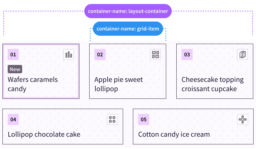
A key concept is that a container query cannot style the container itself. That’s why we haven’t made the actual .card a container, but are looking to its direct ancestor of the grid-item container to attach the container query. The grid-item container will be equivalent to the inline-size of the card itself since it directly wraps the card.
We can also use the new media range query syntax when using container size queries. This enables math operators like > (greater than) to compare values.
We’ll assign the “wide” variation styles when the grid-item container’s inline size is greater than 35ch.
/* Wide variation container size query */
@container grid-item (inline-size > 35ch) {
  .card {
    grid-auto-flow: column;
    align-items: center;
    justify-content: start;
    gap: 5cqi;
  }
}
The styles switch the grid orientation into columns instead of the default of rows, which places the number and icon container on the starting side. Then, we’ve added some alignment as well as gap.
The gap property slips in another excellent feature from the container queries spec which is container units. The cqi unit we’ve used stands for “container query inline”, so effectively this value will render as 5% of the calculated inline size, expanding for larger spaces and shrinking for smaller spaces.
One more adjustment for this variation is to stack the number and icon, so we'll add those styles to the container query.
@container grid-item (inline-size > 35ch) {
  .card__number-icon {
    flex-direction: column;
    gap: 1rem;
  }
}
There’s one last adjustment we have, and it will be based on how much room the card grid layout has available. That means we’ll switch and query the layout-container.
The adjustment is to set an aspect-ratio for the default card variations. We’ll also have to add a style to unset the ratio for the wide variation.
@container layout-container (inline-size > 80ch) {
  .card {
    aspect-ratio: 4/3;
  }
}

@container grid-item (inline-size > 35ch) {
  .card {
    /* Keep other styles */
    aspect-ratio: unset;
  }
}
You may safely use aspect-ratio without worry of content overflow because the ratio is forgiving, and allows content size to take precedence. Unless dimension properties also limit the element size, the aspect-ratio will allow content to increase the element’s size.
That said, we will also place one dimension property of max-width: 100% on the card so that it stays within the confines of the grid item. Flexbox by itself will not force the element to a particular size, so the aspect-ratio could cause it to grow outside the flex item boundary. Adding max-inline-size will keep the growth in check while allowing longer content to increase the height when needed.
@container layout-container (inline-size > 80ch) {
  .card {
    aspect-ratio: 4/3;
    max-inline-size: 100%;
  }
}
CSS for "Card Container Queries"
@container layout-container (inline-size > 80ch) {
  .card {
    aspect-ratio: 4/3;
    max-width: 100%;
  }
}

@container grid-item (inline-size > 35ch) {
  .card {
    grid-auto-flow: column;
    align-items: center;
    justify-content: start;
    gap: 5cqi;
    aspect-ratio: unset;
  }

  .card__number-icon {
    flex-direction: column;
    gap: 1rem;
  }
}
Container Query Fluid Type
#According to our mockup, the last adjustment we need is to increase the font size as the card becomes wider.
We’ll set up a range of allowed values using clamp(). This function accepts three values: a minimum, an ideal, and a maximum. If we provide a dynamic value for the middle ideal, then the browser can interpolate between the minimum and maximum.
We’ll use the cqi unit for the ideal value, which means the font-size will be relative to the inline size of the card. Therefore, narrower cards will render a font-size toward the minimum end of the range, and wider cards will have a font-size toward the maximum end.
A neat thing about container queries is that all elements are style containers by default. This means there is no need to wrap a rule with a container query to use container query units - they are available to all elements!
.card :is(h2, h3) {
  font-size: clamp(1.25rem, 5cqi, 1.5rem);
}
While this technique is more than sufficient for a single component, you may be interested in my article covering three fluid typography techniques applied via a “mixin” using custom properties.
One last modern CSS feature we'll use to conclude our card styles will upgrade the headings. Use of text-wrap: balance will evaluate a text block of up to six lines and "balance" it by inserting visual line breaks. This helps short passages of text, like headlines, have a more pleasing appearance. It's a great progressive enhancement because it looks great if it works and doesn't cause harm if it fails. However, balancing does not change an element's computed width, so a side-effect in some layouts may be an increase in unwanted space next to the text.
.card :is(h2, h3) {
  text-wrap: balance;
}
CSS for "Card Fluid Type"
.card :is(h2, h3) {
  font-size: clamp(1.25rem, 5cqi, 1.5rem);
  text-wrap: balance;
}
Component: Pagination
#The pagination component benefits from container size queries since it is expected to modify the visibility of elements depending on the available inline space.
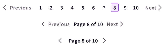
The default view which appears at the narrowest space will show only the .pagination-label and the arrow icons from the “Previous” and “Next” controls.
In slightly wider spaces, the labels for the “Previous” and “Next” controls will be visible.
Finally, once there is enough inline space, the .pagination-label will be swapped out for the full .pagination-list with numbered links to each page.
<nav class="pagination-container" aria-label="Pagination">
  <a href="" class="pagination-nav pagination-nav__prev">
    <svg />
    <span class="pagination-nav__label">Previous</span>
  </a>

  <span class="pagination-label">Page 3 of 8</span>

  <ul class="pagination-list">
    <li><!-- pagination links --></li>
  </ul>

  <a href="" class="pagination-nav pagination-nav__next">
    <svg />
    <span class="pagination-nav__label">Next</span>
  </a>
</nav>
We'll first define containment for the .pagination-container to enable this dynamic layout behavior.
.pagination-container {
  container-type: inline-size;
}
The styles for our default view have already hidden the .pagination-list and .pagination-nav labels. Important to note is that technique for hiding the .pagination-nav labels still makes the text available for users of assistive technology such as screen readers.
Time for the first level of our container size queries, which is simply unsetting the styles currently hiding the .pagination-nav labels.
@container (min-width: 25ch) {
  .pagination-nav__label {
    height: auto;
    overflow: unset;
    position: unset;
    clip-path: unset;
  }
}
Following that, we’ll add a container size query to hide the .pagination-label and reveal the full .pagination-list.
@container (min-width: 40ch) {
  .pagination-list {
    display: grid;
  }

  .pagination-label {
    display: none;
  }
}
CSS for "Pagination Container Queries"
.pagination-container {
  container-type: inline-size;
}

@container (min-width: 25ch) {
  .pagination-nav__label {
    height: auto;
    overflow: unset;
    position: unset;
    clip-path: unset;
  }
}

@container (min-width: 40ch) {
  .pagination-list {
    display: grid;
  }

  .pagination-label {
    display: none;
  }
}
Using :has() for Quantity Queries
#While the pagination layout transition happens smoothly for the current list of items, we have a potential problem. Eventually, the pagination list could grow much larger than ten items, which may lead to overflow if the container isn’t actually wide enough to hold the larger list.
To help manage that condition, we can bring back :has() and use it to create quantity queries, which means modifying styles based on checking the number of items.
We'd like to keep the medium appearance for the pagination component if the list has more than 10 items. To check for that quantity, we can use :has() with :nth-child and check for an 11th item. This signifies that list has at least 11 items, which exceeds the list limit of 10.
We must place this rule within the "large" container query so that it overrides the other styles we planned for lists with 10 or fewer items and doesn't apply too early.
@container (min-width: 40ch) {
  .pagination-container:has(li:nth-child(11)) {
    .pagination-list {
      display: none;
    }

    .pagination-label {
      display: block;
    }
  }
}
CSS for "Pagination Quantity Queries"
@container (min-width: 40ch) {
  .pagination-container:has(li:nth-child(11)) {
    .pagination-list {
      display: none;
    }

    .pagination-label {
      display: block;
    }
  }
}
You can open your browser dev tools and delete a couple of the list items to see the layout change to reveal the full list again once there are 10 or fewer.
Upgrading to Style Queries
#So far, we’ve been working with container size queries, but another type is container style queries. This means the ability to query against the computed values of CSS properties of a container.
Just like size queries, style queries cannot style the container itself, just it’s children. But the property you are querying for must exist on the container.
Use of a style query requires the style signifier prior to the query condition. Presently, support for style queries is available in Chromium within the scope of querying for custom property values.
@container style(--my-property: true) {
  /* Styles for the container's children */
}
Instead of creating the quantity queries for the pagination component within the size query, we’ll switch and define a custom property for the .pagination-container to be used for a style query. This can be part of the default, non-container query rules for this element.
.pagination-container:has(li:nth-child(11)) {
  --show-label: true;
}
A feature of custom properties is they can be almost any value, so here we’re using it to create a boolean toggle. I’ve picked the name --show-label because when this is true, we will show the .pagination-label instead of the .pagination-list.
Now, while we can’t directly combine size and style container queries, we can nest the style query within the size query. This is important because just as before we also want to ensure these styles only apply for the larger container size query.
The pagination-related styles remain the same; we've just switched the application to use a style query. The style query requires a value for the custom property, so we've borrowed the familiar convention of a boolean value to treat this like a toggle.
@container (min-width: 40ch) {
  @container style(--show-label: true) {
    .pagination-list {
      display: none;
    }

    .pagination-label {
      display: block;
    }
  }
}
CSS for "Pagination Style Queries"
.pagination-container:has(li:nth-child(11)) {
  --show-label: true;
}

@container (min-width: 40ch) {
  @container style(--show-label: true) {
    .pagination-list {
      display: none;
    }

    .pagination-label {
      display: block;
    }
  }
}
Component: Navigation
#This navigation component is intended to contain a site's primary navigation links and branding. It features a fairly commonplace display of the logo followed by the top-level page links and then supplementary actions for "Login" and "Sign Up" placed on the opposite side.
Once again, this component will benefit from container size and style queries to manage the visibility of elements depending on the amount of available inline space.
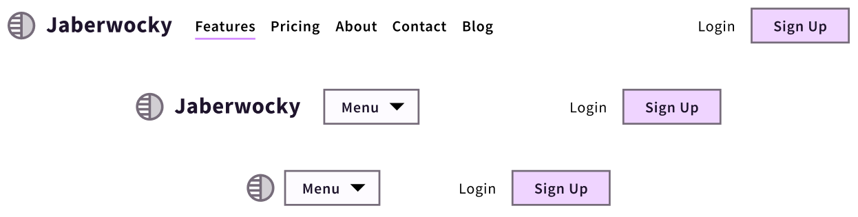
As the space narrows, the horizontal link list is replaced with a button labeled “Menu” which can toggle a dropdown version of the links. At even more narrow spaces, the logo collapses to hide the brand name text and leave only the logomark visible.
To accomplish these views, we’ll leverage named containers to better target the container queries. The navigation wrapper will be named navigation and the area containing the links will be named menu. This allows us to treat the areas independently and contextually manage the behavior.
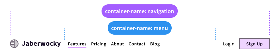
Here's our markup outline to help understand the relationships between our elements.
<nav class="navigation">
  <a href="#" class="navigation__brand">Logo</a>

  <div class="navigation__menu">
    <button type="button" aria-expanded="false" aria-controls="#menu">
      Menu
    </button>

    <ul id="menu" role="list">
      <!-- link list -->
    </ul>
  </div>

  <div class="navigation__actions">
    <!-- Login / Sign Up -->
  </div>
</nav>
You'll likely find that building with container queries in mind may prompt rethinking your HTML structure and simplifying the hierarchy.
An important part of our construction that’s already in place for the baseline styles is that the .navigation wrapper is setup to use CSS grid. In order for the .navigation__menu area to have an independent and variable container size to query for, we’ve use a grid column width of 1fr. This means it is allowed to use all the remaining space leftover after the logo and actions elements reserve their share, which is accomplished by setting their column size to auto.
.navigation {
  display: grid;
  grid-template-columns: auto 1fr auto;
}
The rest of our initial state is already in place, and presently assumes the most narrow context. The visible elements are the logomark, “Menu” button, and the additional actions. Now, we’ll use container queries to work out the visibility of the medium and large stages.
The first step is defining the containers. We’ll use the container shorthand property, which accepts the container name first and then the container type, with a forward slash (/) as a separator.
.navigation {
  container: navigation / inline-size;
}

.navigation__menu {
  container: menu / inline-size;
}
First, we'll query against the navigation container and allow the brand name to be visible once space allows. This component uses the same accessibly hidden technique as was used for the pagination, so the visibility styles may look familiar. Also, note the use of the media range syntax to apply the styles when the inline-size is greater than or equal to the comparison value.
@container navigation (inline-size >= 45ch) {
  .navigation__brand span {
    height: auto;
    overflow: unset;
    position: unset;
    clip-path: unset;
  }
}
The second stage is to reveal the link list and hide the “Menu” button. This will be based on the amount of space the menu container area has, thanks to the grid flexibility noted earlier.
@container menu (inline-size >= 60ch) {
  .navigation__menu button {
    display: none;
  }

  .navigation__menu ul {
    display: flex;
  }
}
CSS for "Navigation Container Queries"
.navigation {
  container: navigation / inline-size;
}

.navigation__menu {
  container: menu / inline-size;
}

@container navigation (inline-size >= 45ch) {
  .navigation__brand span {
    height: auto;
    overflow: unset;
    position: unset;
  }
}

@container menu (inline-size >= 60ch) {
  .navigation__menu button {
    display: none;
  }

  .navigation__menu ul {
    display: flex;
  }
}
Given the demo size constraints, you may not see the list until you resize the demo container larger.
Improve Scalability With Quantity and Style Queries
#Depending on the length of the link list, we may be able to reveal it a bit sooner. While we would still need JavaScript to compute the total dimension of the list, we can use a quantity query to anticipate the space to provide.
Our present container size query for the menu container requires 80ch of space. We will add a quantity query to create a condition of whether or not to show the links given a list with six or more items. We'll set the --show-menu property to true if that is met.
.navigation__menu:has(:nth-child(6)) {
  --show-menu: true;
}
Now we'll add one more container size query with a nested style query. The size query will take advantage of the media range syntax again, this time to create a comparison range. We'll provide both a lower and upper boundary and check if the inline-size is equal to or between those bounds, thanks to this new ability to use math operators for the query.
@container menu (40ch <= inline-size <= 60ch) {
  /* Styles when the container size is between 50-80ch */
}
Then, within that we nest a style query. The style rules are intended to keep the “Menu” button hidden and the link list visible, so we’ll also include the not operator. That means the rules should apply when the container does not meet the style query condition.
@container menu (40ch <= inline-size <= 60ch) {
  @container not style(--show-menu: true) {
    .navigation__menu button {
      display: none;
    }

    .navigation__menu ul {
      display: flex;
    }
  }
}
Important to note is that the container size query we already wrote for the menu container when it is sized >= 60ch should remain as is, otherwise the display will flip back to prioritizing the “Menu” button above 60ch.
CSS for "Navigation Quantity & Style Queries"
.navigation__menu:has(:nth-child(6)) {
  --show-menu: true;
}

@container menu (40ch <= inline-size <= 60ch) {
  @container not style(--show-menu: true) {
    .navigation__menu button {
      display: none;
    }

    .navigation__menu ul {
      display: flex;
    }
  }
}
Container Queries, Accessibility, and Fail-Safe Resizing
#Since container queries enable independent layout adjustments of component parts, they can help to meet the WCAG criterion for reflow. The term "reflow" refers to supporting desktop zoom of up to 400% given a minimum resolution of 1280px, which at 400% computes to 320px of inline space.
Discussing reflow is not new here on ModernCSS - learn more about reflow and other modern CSS upgrades to improve accessibility.
While we don’t have a “zoom” media query, both media queries and container queries that affect the layout approaching 320px will have an impact. The goal of the reflow criterion is to prevent horizontal scroll by “reflowing” content into a single column.
Taking our navigation as an example, here's a video demonstration of increasing zoom to 400%. Notice how the layout changes similarly to narrowing the viewport.
The advantage of container queries is that they are more likely to succeed under zoom conditions than media queries which may be tied to a presumed set of "breakpoints."
Often, the set of breakpoints frameworks use can begin to fail at the in-between conditions that aren't precisely a match for device dimensions. Those may be hit by zoom or other conditions like split-screen usage.
Thoughtful usage of container queries makes your components and layouts far more resilient across unknown conditions, whether those conditions are related to device size, user capabilities, or contexts only an AI bot could dream up.
Supporting and Using Modern CSS Features
#The previous post in this series is all about testing features support for modern CSS features. However, there’s one consideration that is top of mind for me when choosing what features to begin using.
When evaluating whether a feature is "safe to use" with your users, considering the impact of the feature you're looking to integrate weighs heavily in the decision. For example, some modern CSS features are "nice to haves" that provide an updated experience that's great when they work but also don't necessarily cause an interruption in the user experience should they fail.
The features we reviewed today can absolutely have a large impact, but the context of how they are used also matters. The ways we incorporated modern CSS in the components were, by and large, progressive enhancements, meaning they would fail gracefully and have minimal impact.
It's always important to consider the real users accessing your applications or content. Therefore, you may decide to prepare fallbacks, such as a set of styles that uses viewport units when container queries are unavailable. Or, switching some of the :has() logic to require a few extra classes for applying the styles until you are more comfortable with the level of support.
As a quick measure, consider whether a user would be prevented from doing the tasks they need to do on your website if the modern feature fails.
Remember: there's no need to use everything new right away, but learning about what's available is beneficial so you can confidently craft a resilient solution.
This material was originally presented at CSS Day 2023 and updated for Front-end Design Conference 2024.