Using a combination of the following properties, we can create custom, accessible, cross-browser, theme-able, scalable radio buttons in pure CSS:
currentColorfor theme-abilityemunits for relative sizingappearance: nonefor full restyling access- CSS grid layout to align the input and label
Head's up: A lot of these styles overlap with the episode on custom checkbox styles which you might be interested in reading next!
Now available: my egghead video course Accessible Cross-Browser CSS Form Styling. You'll learn to take the techniques described in this tutorial to the next level by creating a themable form design system to extend across your projects.
Radio Button HTML
#There are two appropriate ways to layout radio buttons in HTML.
The first wraps the input within the label. This implicitly associates the label with the input that its labeling, and also increases the hit area to select the radio.
<label>
  <input type="radio" name="radio" />
  Radio label text
</label>
The second is to have the input and label be siblings and use the for attribute set to the value of the radio's id to create the association.
<input type="radio" name="radio" id="radio1" />
<label for="radio1">Radio label text</label>
Our technique will work with either setup, although we're going to select the wrapping label method to prevent including an extra div.
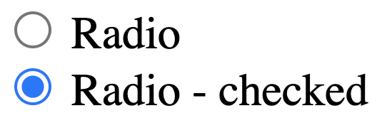
The base HTML for our demo including classes and two radios - necessary to test :checked vs. un-checked states - is the following:
<label class="form-control">
  <input type="radio" name="radio" />
  Radio
</label>

<label class="form-control">
  <input type="radio" name="radio" />
  Radio - checked
</label>
For groups of radio buttons, it is also necessary to provide the same name attribute.
Here's how the native HTML elements in Chrome appear:
Common Issues with Native Radio Buttons
#The primary issue that causes developers to seek a custom styling solution for radio buttons is the variance in their appearance between browsers which is increased when including mobile browsers as well.
As an example, here are radio buttons as shown on Mac versions of Firefox (left), Chrome (middle), and Safari (right):

Our solution will accomplish the following goals:
- scale with the
font-sizeprovided to thelabel - gain the same color as provided to the label for ease of theme-ability
- achieve a consistent, cross-browser design style, including
:focusstate - maintain keyboard and color contrast accessibility
If your primary goal is modifying the
:checkedstate color, you may be interested in learning more about the upcomingaccent-colorproperty from Michelle Barker's overview.
Theme Variable and box-sizing Reset
#There are two base CSS rules that must be placed first in our cascade.
First, we create a custom variable called --color which we will use as a simple way to easily theme our radio buttons.
:root {
  --form-control-color: rebeccapurple;
}
Next, we use the universal selector to reset the box-sizing method used to border-box. This means that padding and border will be included in the calculation of any elements computed final size instead of increasing the computed size beyond any set dimensions.
*,
*:before,
*:after {
  box-sizing: border-box;
}
Label Styles
#Our label uses the class of .form-control. The base styles we'll include here are font styles. Recall from earlier that the font-size will not yet have an effect on the visual size of the radio input.
CSS for ".form-control font styles"
.form-control {
  font-family: system-ui, sans-serif;
  font-size: 2rem;
  font-weight: bold;
  line-height: 1.1;
}
We're using an abnormally large font-size just to emphasize the visual changes for purposes of the tutorial demo.
Our label is also the layout container for our design, and we're going to set it up to use CSS grid layout to take advantage of gap.
CSS for ".form-control grid layout"
.form-control {
  font-family: system-ui, sans-serif;
  font-size: 2rem;
  font-weight: bold;
  line-height: 1.1;
  display: grid;
  grid-template-columns: 1em auto;
  gap: 0.5em;
}
Custom Radio Button Style
#Ok, this is the part you came here for!
The original version of this tutorial demonstrated use of extra elements to achieve the desired effect. Thanks to improved support of
appearance: noneand with appreciation to Scott O'Hara's post on styling radio buttons and checkboxes, we can rely on pseudo elements instead!
Join my newsletter for article updates, CSS tips, and front-end resources!
Step 1: Hide the Native Radio Input
#We need to hide the native radio input, but keep it technically accessible to enable proper keyboard interaction and also to maintain access to the :focus state.
To accomplish this, we only need to set appearance: none. This removes nearly all inherited browser styles and gives us access to styling the input's pseudo elements. Notice we have two additional properties to complete the reset.
CSS for "hiding the native radio input"
input[type="radio"] {
  /* Add if not using autoprefixer */
  -webkit-appearance: none;
  appearance: none;
  /* For iOS < 15 to remove gradient background */
  background-color: #fff;
  /* Not removed via appearance */
  margin: 0;
}
Worried about support? This combination of using
appearance: noneand the ability to style the input's pseudo elements has been supported since 2017 in Chrome, Safari, and Firefox, and in Edge since their switch to Chromium in May 2020.
Step 2: Custom Unchecked Radio Styles
#For our custom radio, we'll update box styles on the base input element. This includes inheriting the font styles to ensure the use of em produces the desired sizing outcome, as well as using currentColor to inherit any update on the label's color.
We use em for the width, height, and border-width value to maintain the relative appearance. Good ole border-radius: 50% finishes the expected appearance by rendering the element as a circle.
CSS for "custom unchecked radio styles"
input[type="radio"] {
  appearance: none;
  background-color: #fff;
  margin: 0;
  font: inherit;
  color: currentColor;
  width: 1.15em;
  height: 1.15em;
  border: 0.15em solid currentColor;
  border-radius: 50%;
}

.form-control + .form-control {
  margin-top: 1em;
}
Finally, we slid in a little style to provide some space between our radios by applying margin-top with the help of the adjacent sibling combinator;
Step 3: Improve Input vs. Label Alignment
#If you've worked with grid or flexbox, your instinct right now might be to apply align-items: center to optically tune the alignment of the input in relation to the label text.
But what if the label is long enough to become broken across multiple lines? In that case, alignment along horizontal center may be undesirable.
Instead, let's make adjustments so the input stays horizontally centered in relation to the first line of the label text.
On our input, we'll use transform to nudge the element up. This is a bit of a magic number, but as a starting point this value is half the size of the applied border.
CSS for "improve input vs. label alignment"
input[type="radio"] {
  appearance: none;
  background-color: #fff;
  margin: 0;
  font: inherit;
  color: currentColor;
  width: 1.15em;
  height: 1.15em;
  border: 0.15em solid currentColor;
  border-radius: 50%;
  transform: translateY(-0.075em);
}
And with that our alignment is complete and functional for both single-line and multi-line labels.
Step 4: The :checked State
#It's now time to bring in our ::before pseudo element which will be styled in order to represent the :checked state.
The
:checkednaming convention may be a little confusing here, but it is a CSS selector that is available for both radio buttons and checkboxes.
We first need to change the display behavior of the input to use grid:
input[type="radio"] {
  /* ...existing styles */

  display: grid;
  place-content: center;
}
This is the quickest way to align the :before to the horizontal and vertical center of our custom control.
Then, we create the :before element, including a transition and using transform hide it with scale(0):
input[type="radio"]::before {
  content: "";
  width: 0.65em;
  height: 0.65em;
  border-radius: 50%;
  transform: scale(0);
  transition: 120ms transform ease-in-out;
  box-shadow: inset 1em 1em var(--form-control-color);
}
Use of box-shadow instead of background-color will enable the state of the radio to be visible when printed (h/t Alvaro Montoro).
Finally, when the input is :checked, we make it visible with scale(1) with a nicely animated result thanks to the transition. Be sure to click between the radios to see the animation!
CSS for ":checked state styles"
input[type="radio"] {
  /* ...existing styles */
  display: grid;
  place-content: center;
}

input[type="radio"]::before {
  content: "";
  width: 0.65em;
  height: 0.65em;
  border-radius: 50%;
  transform: scale(0);
  transition: 120ms transform ease-in-out;
  box-shadow: inset 1em 1em var(--form-control-color);
}

input[type="radio"]:checked::before {
  transform: scale(1);
}
High Contrast Themes and Forced Colors
One more state we need to ensure our radio responds to is what you may hear referred to as "Windows High Contrast Mode" (WHCM). In this mode, the user's operating system swaps out color-related properties for a reduced palette which is an incoming part of the CSS spec called "forced-colors".
In this mode, our box-shadow is completely removed, leaving these users without an indicator of the checked state.
Fortunately, resolving this involves adding just one extra property. We'll provide a background-color, which is normally removed in forced-colors mode, but will be retained if we use one of the defined forced colors. In this case, we're selecting CanvasText which will match the regular body text color.
Due to the style stacking order, our box-shadow that we've themed for use in regular mode is actually visuallly placed over the background-color, meaning we can use both without any further modifications.
CSS for "supporting forced-colors"
input[type="radio"]::before {
  /* ...existing styles */

  /* Windows High Contrast Mode */
  background-color: CanvasText;
}
Step 5: The :focus State
#Depending on your browser, you may already be seeing some kind of a focus style provided as an outline. We'll add just a tiny bit of customization to make it match our input's color, and provide some space from the input by using outline-offset.
This is a simplification from the earlier version of this tutorial which used box-shadow. Now, evergreen browsers all support outline which follows border-radius, removing an excuse not to just use the outline!
Remember:
:focusis a temporary state, but it's very important that it is highly visible to ensure the accessibility of your form controls and other interactive elements.
CSS for ":focus state styles"
input[type="radio"]:focus {
  outline: max(2px, 0.15em) solid currentColor;
  outline-offset: max(2px, 0.15em);
}
And with that, the essential styles for a custom radio button are complete! 🎉
Experimental: Using :focus-within to Style the Label Text
#Since the label is not a sibling of the native input, we can't use the :focus state of the input to style it.
An upcoming pseudo selector is :focus-within, and one feature is that it can apply styles to elements that contain an element which has received focus.
The ModernCSS episode on a pure CSS accessible dropdown navigation menu also covered
:focus-within.
For now, any critial usage of :focus-within requires a polyfill, so the following styles should be considered an enhancement and not relied on as the only way to provide a visual indication of focus.
We'll test for focus by adding a rule for :focus-within on the label (.form-control). This means when the native input - which is a child and therefore "within" the label - receives focus, we can style any element within the label while focus is active.
CSS for "experimental :focus-within styles"
.form-control:focus-within {
  color: var(--form-control-color);
}
Demo
#Here is the solution altogether in a CodePen that you can fork and experiment with further.
Check out the custom checkbox styling to also learn how to extend styles to the :disabled state, and see how to work with clip-path as a :checked indicator.